DESIGN PORTFOLIO
Greetings, my name is Stiina!
Media design graduate from Pallas University of Applied Sciences and an aspiring digital product designer, currently looking for new challenges
Take a look at my work
BACHELOR'S THESIS / PALLAS / SPRING OF 2024
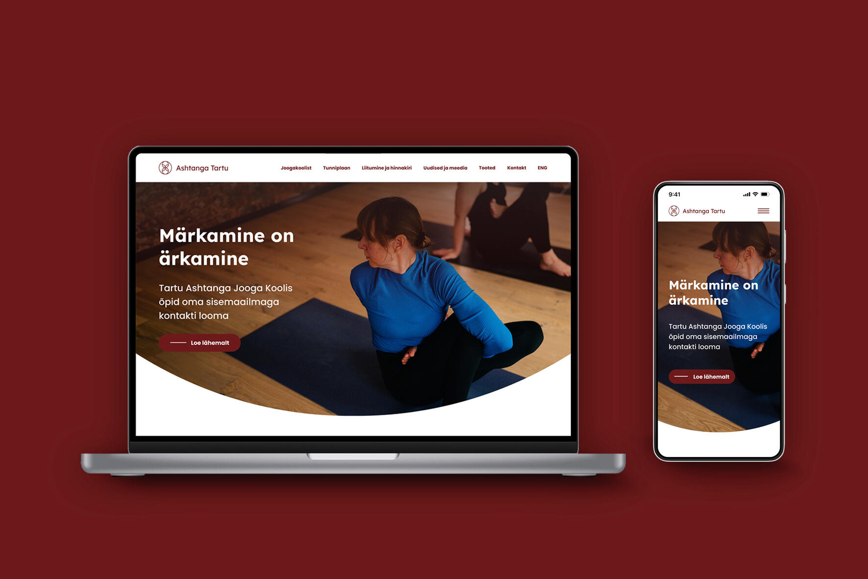
Website Design for Tartu Ashtanga Yoga School
Tartu Ashtanga Yoga School needed a new improved website design for their existing students as well as potential new members. I decided to take on this project as my Bachelor's thesis work.
UX/UI COURSE / PALLAS / FALL OF 2022
Timetable Design Concept for Study Information System Tahvel
In the 3rd year, I participated in an UX/UI course at Pallas University of Applied Sciences. During the course, I had to choose a problem within the existing Tahvel website and find the best possible way to fix it.
UI CHALLENGES / SPRING OF 2023
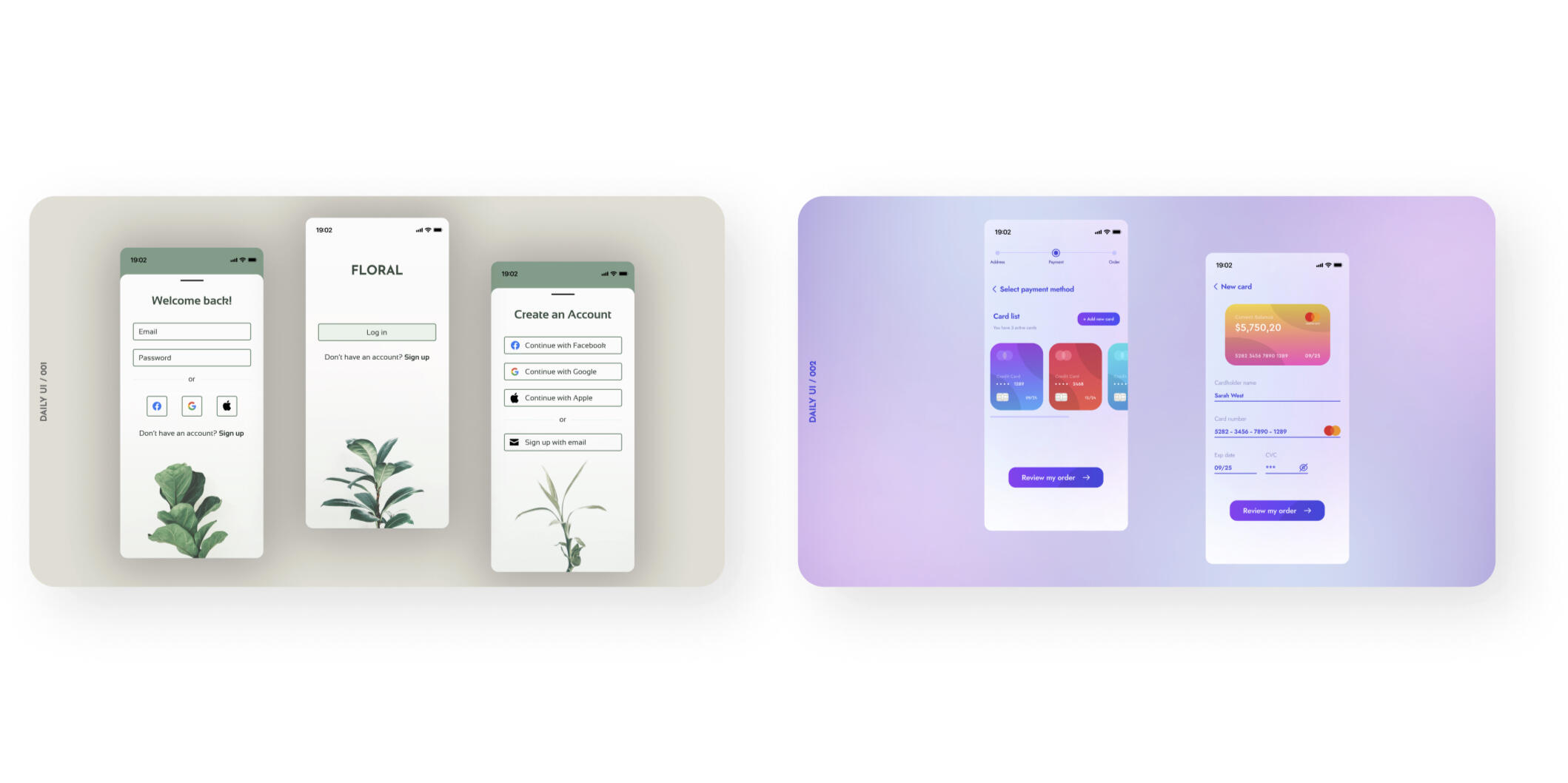
Daily UI challenges
Just a few examples of the UI challenges that I did in the spring of 2023, because practice makes perfect!
Website Design for Tartu Ashtanga Yoga School
01 – Overview
The aim was to develop a website design for Tartu Ashtanga Yoga School and enhance the website's overall usability and user-friendliness as well as to raise awareness about Ashtanga yoga, thereby fostering greater interest in this practice.The primary objective was to enhance both the school's overall image and the perception of its practice, all while ensuring alignment with the company’s identity and values throughout the development of the new website.The design process included me as a designer as well as my thesis supervisors and the team of Tartu Ashtanga Yoga School. The process entailed several tasks.
02 – Starting point
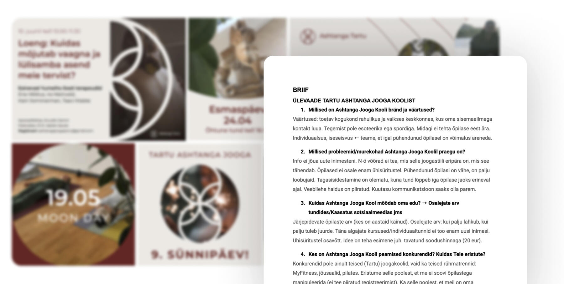
I kicked off the process by crafting a client brief.The aim was to grasp where the company stands now and to understand its mission, values, and identity. In this phase, I gathered crucial details and discovered that one thing was non-negotiable: sticking to the graphic design style already established by Tartu Ashtanga Yoga School.
03 – Research
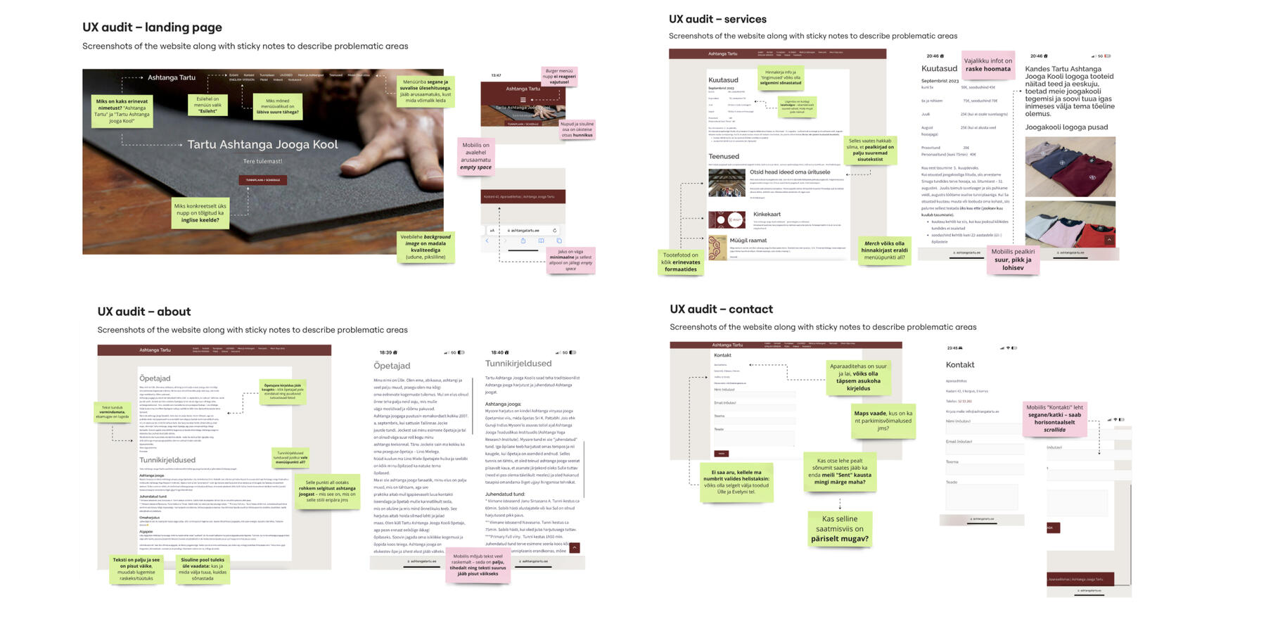
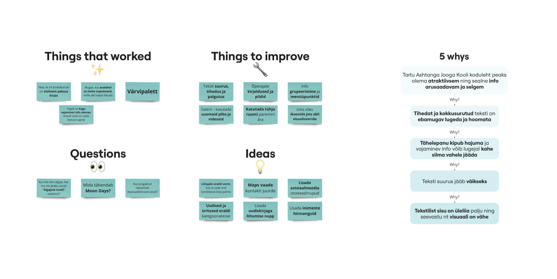
Following that, I delved into desk research, exploring websites of competitors, such as other yoga studios and sports clubs in Tartu.Next, I transitioned to the user research phase, developing a Typeform survey modeled after the previous website to gain insights on user preferences and needs.Simultaneously, I conducted usability tests with four participants, comprising both current and potential students, to identify real-time website usage errors. These tests were designed to mirror the previous website's structure.Based on the gathered information, I moved on to the problem definition phase by doing exercises such as the '5 Whys' and HMW questioning.
04 – Design
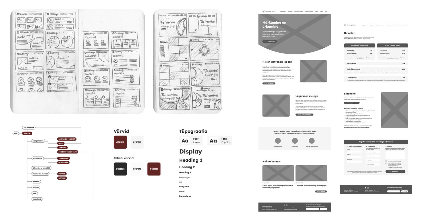
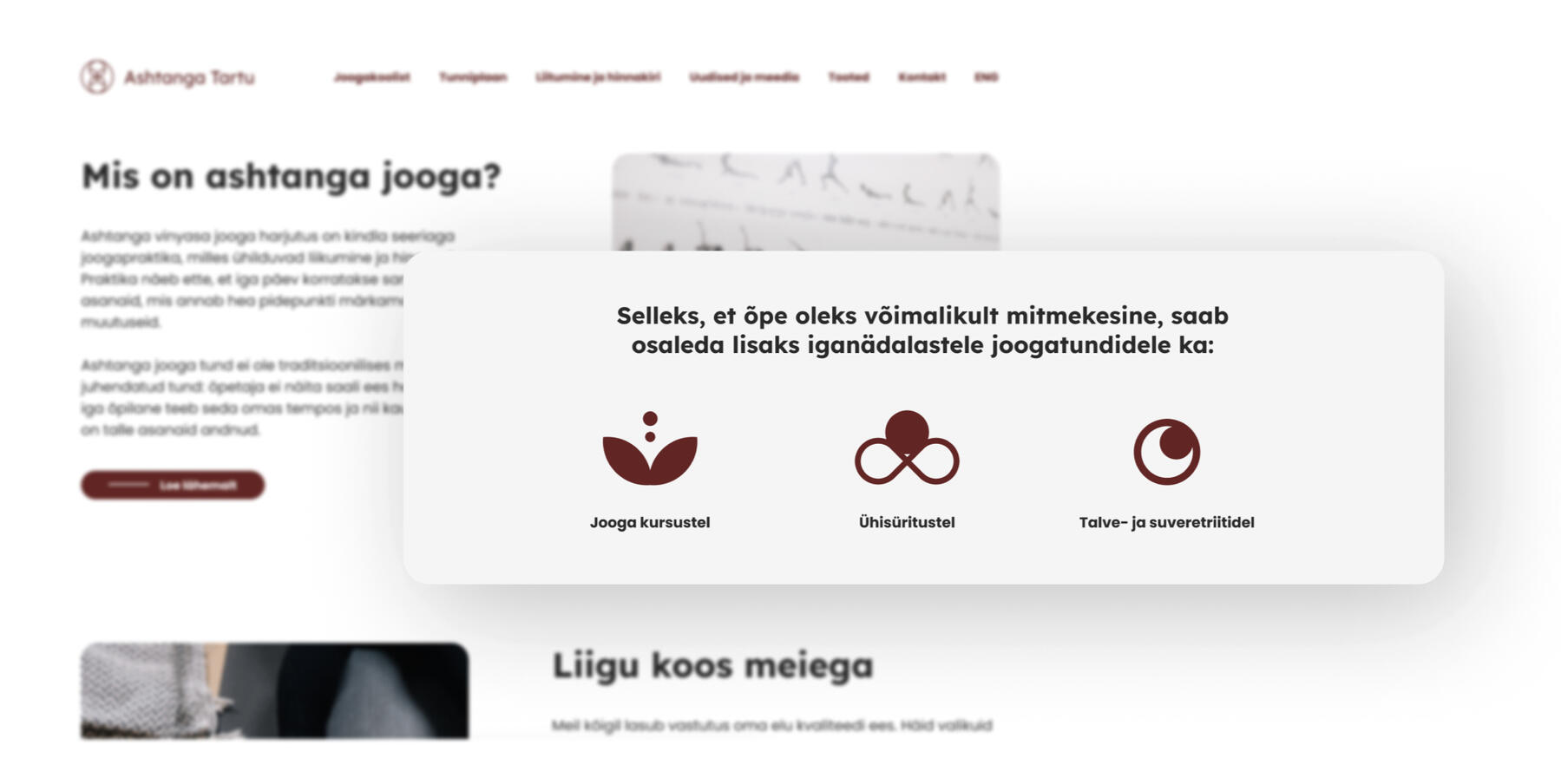
During the research phase, three major issues with the current website surfaced: illogical information architecture, uneven and confusing presentation of information, and an overall dull and outdated vibe both for the site and the school.In my design approach, I prioritized restructuring the information to enhance user comprehension and clarity. This involved incorporating visuals like icons and photos to highlight crucial elements. Furthermore, I aimed to infuse warmth, invitation, and dynamism into the website's ambiance to create a more engaging user experience.The next stage involves constructing and developing the website using the Webflow site builder and gathering feedback from users regarding the updated site.
Timetable Design Concept for Study Information System Tahvel
01 – Defining the problem
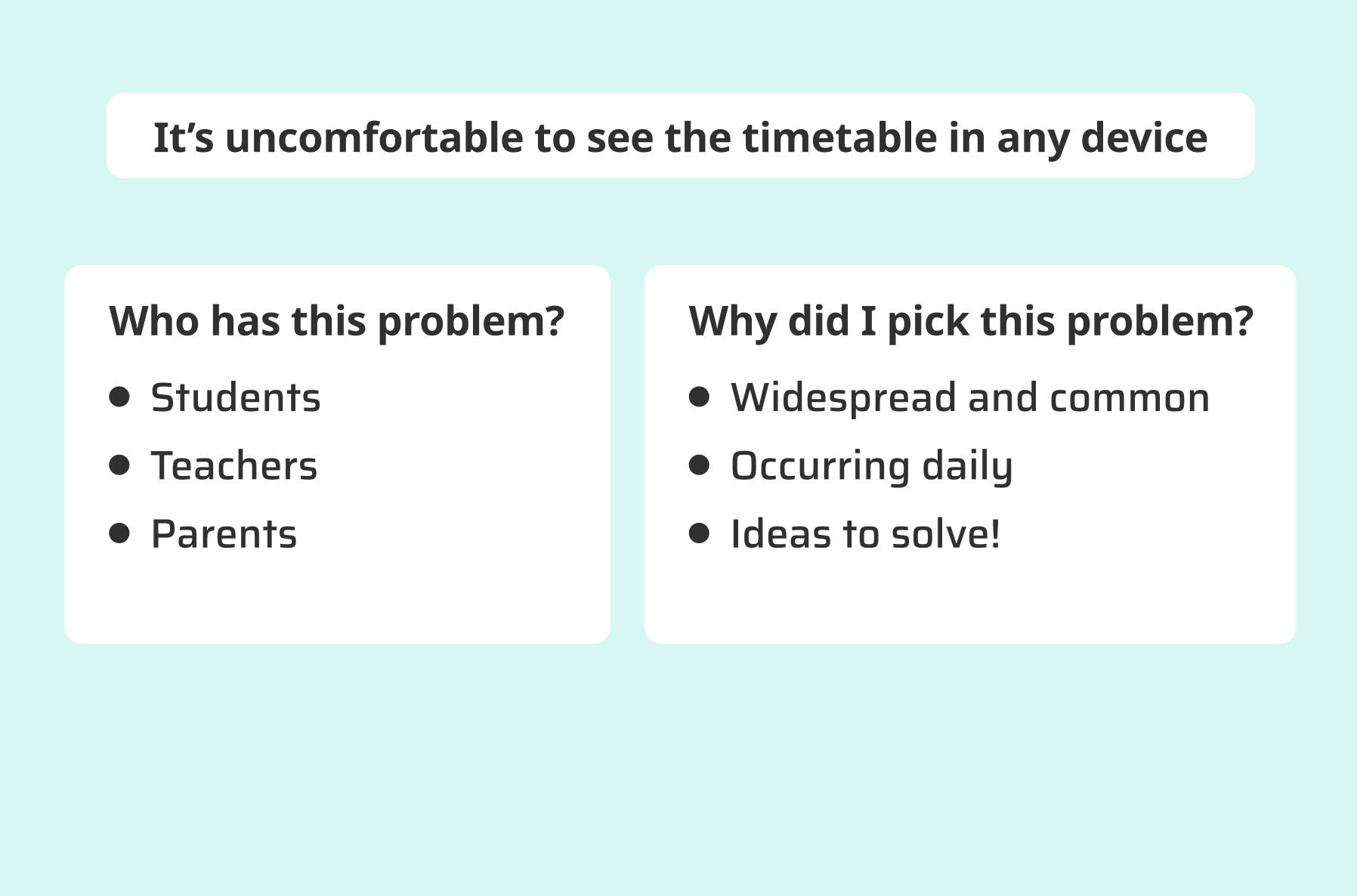
The UX/UI course began with analyzing the current Tahvel website with the whole class.Following that, it was time to individually select and define a specific problem. My choice was to redesign the existing timetable page.To deepen my comprehension of the daily challenges users encounter, I cultivated empathy by crafting user personas, followed by employing the 'How Might We' questioning technique.

02 – UX audit
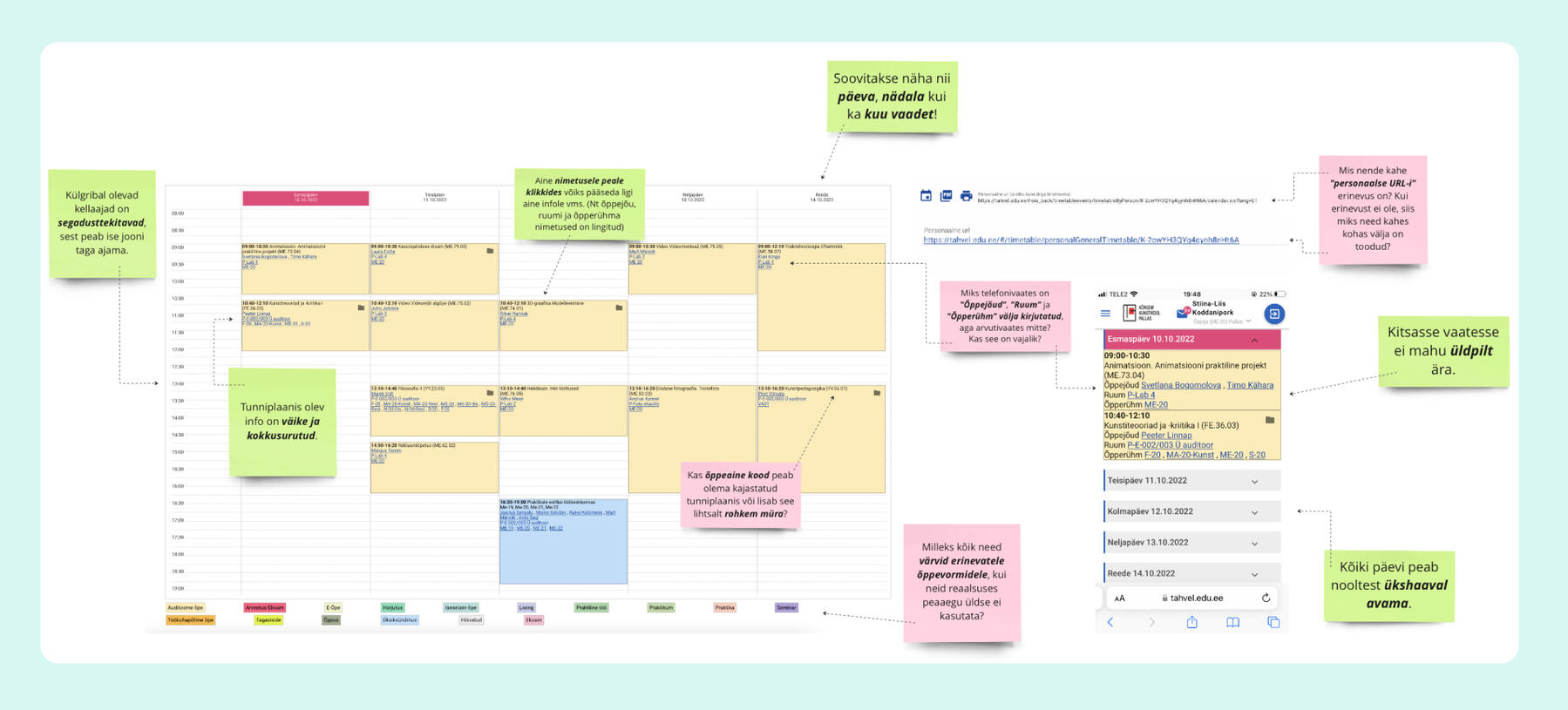
Following the problem definition, the next step involved a comprehensive analysis of every aspect of the current timetable page. In Miro, I used sticky notes to annotate questions, observations, and potential ideas. This phase aimed to pinpoint and emphasize problematic areas, setting the stage for later ideation.
03 – Research
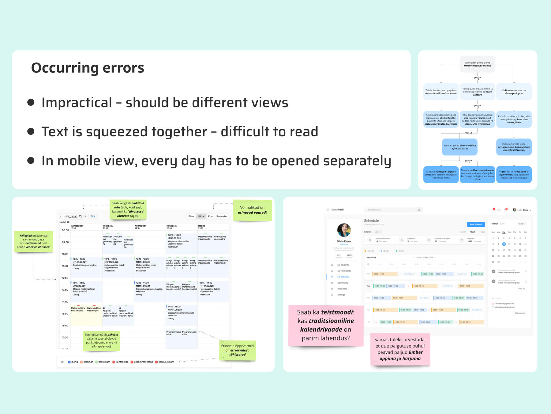
Time to dive into the research part!Firstly, I did some desk research to see what the competitors are doing and to gather some inspiration on how to solve the problem statement mentioned above.Subsequently, I conducted user interviews to delve deeper into users' perceptions of the current page and identify specific errors they encounter.Next, I employed the '5 Whys' exercise to uncover the root cause underlying the observed errors. This exercise aimed to ensure that the ideation phase focused on resolving the right problem effectively.
04 – Ideation
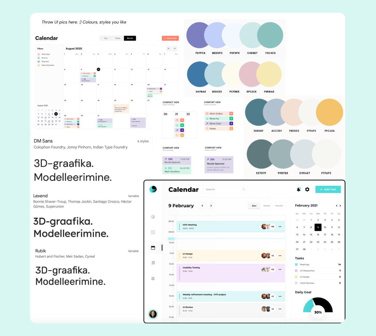
Time to sketch!To brainstorm ideas, I engaged in an exercise known as "Crazy 8s," where I challenged myself to generate and document eight unique solutions within an eight-minute timeframe. This exercise serves as a vital tool for designers to avoid fixating on their initial concepts.Following this, I searched up some color palettes, typography, and layout designs. Using these findings, I curated a moodboard that encapsulated the emotional tone and logical structure I aimed to convey in my design.
05 – Final concept
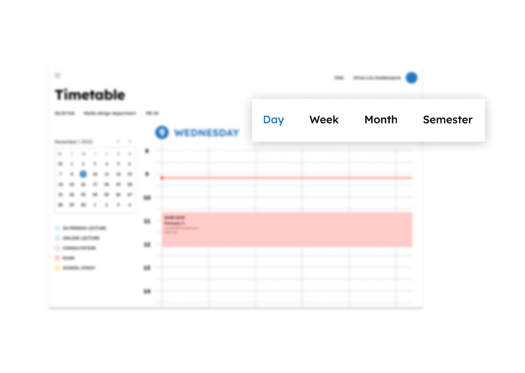
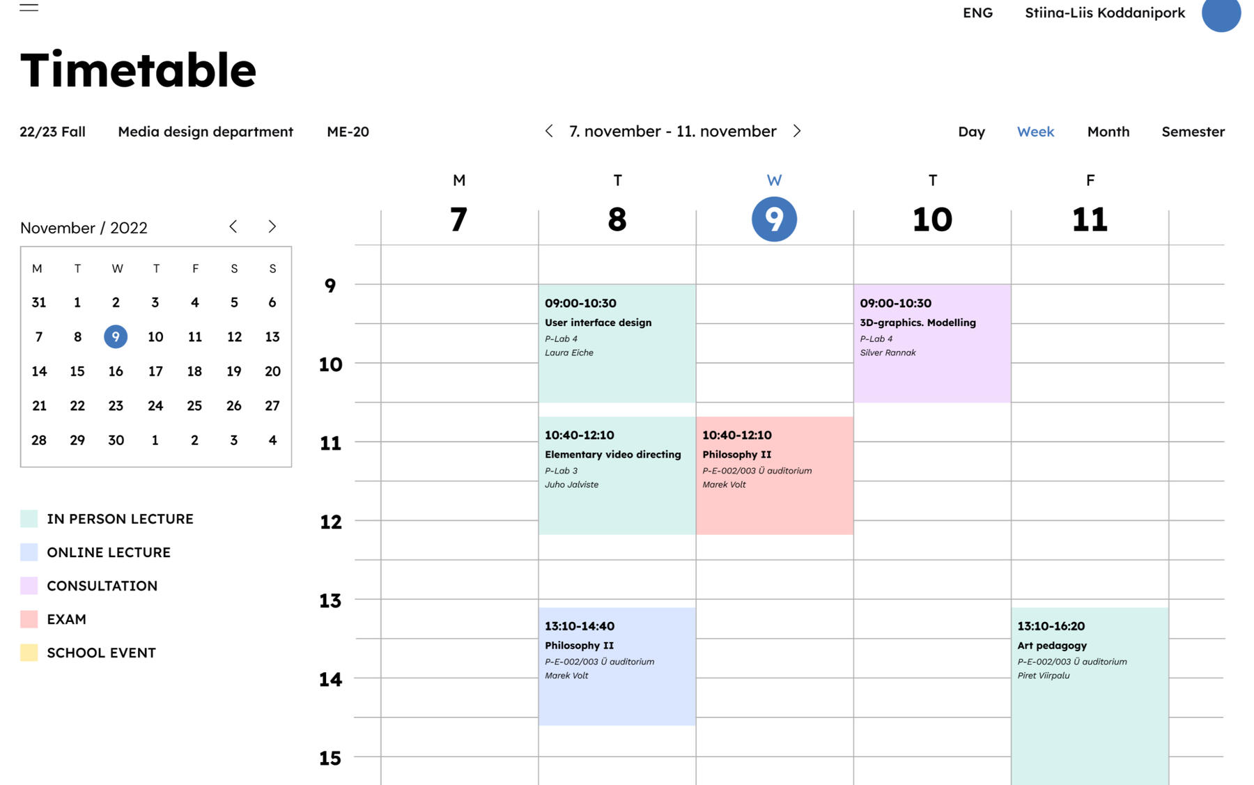
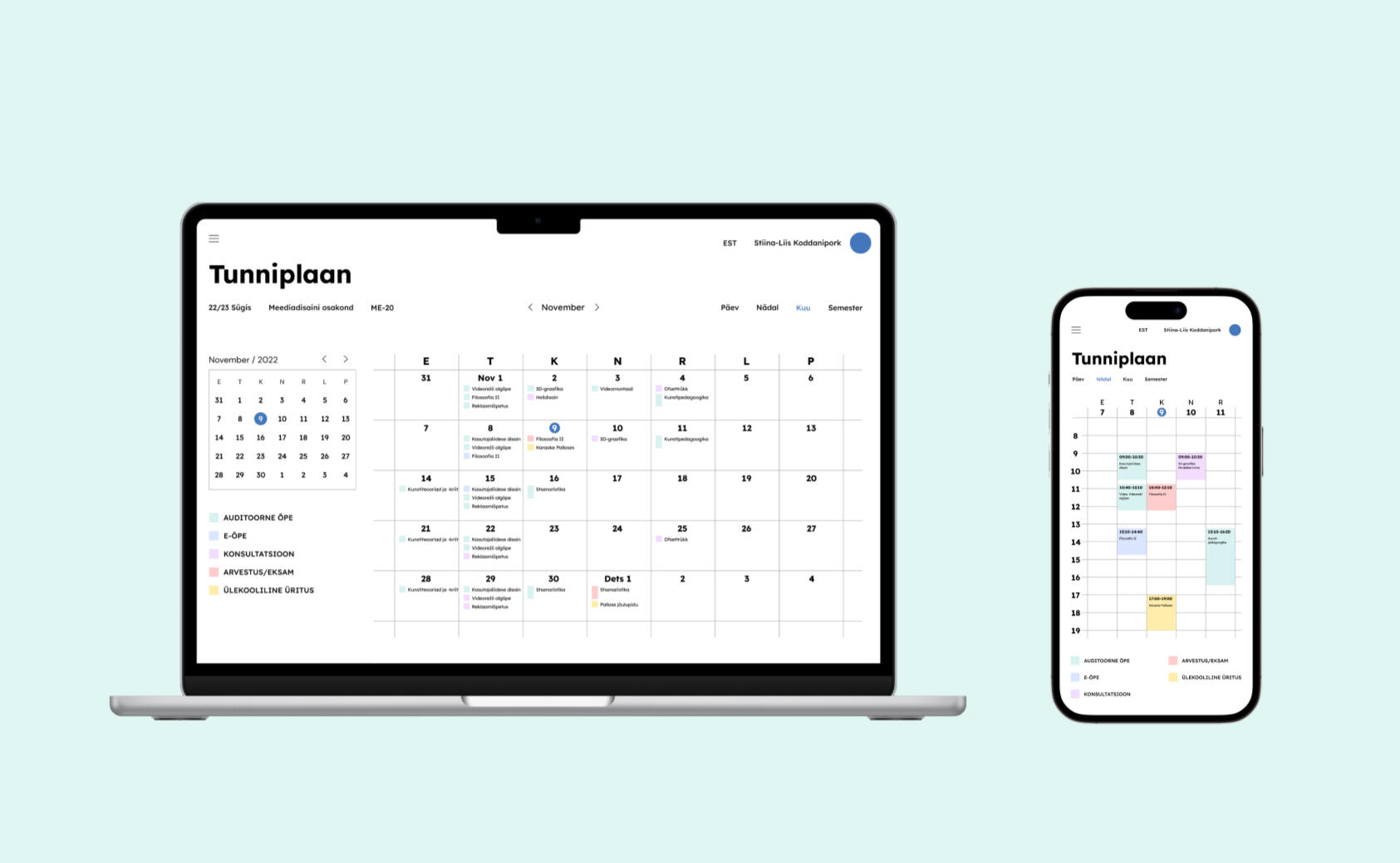
In my design, I emphasized the flexibility for users to select various viewing options, including daily, weekly, monthly, and even semester calendars. Furthermore, I addressed usability concerns specific to mobile devices, recognizing their prominence in users' daily routines.Moving forward with this design, potential next steps include enhancing and diversifying the available views, introducing a dark mode option to the current version, and implementing functionality for users to incorporate their own events or notes into the timetable.Throughout this project, I found myself becoming more interested in UX/UI design. Learning about how to create user-friendly experiences and interfaces really caught my attention. It made me want to learn more about the basics, methods, and creative parts of this field. This new interest not only made my project more exciting but also inspired me to keep learning more about UX/UI design.
